Sorry, Delaware, America’s most underrepresented state
Congratulations for losing the state population lottery, 70 years and counting.
Some of the smallest details in our democracy can have some of the largest impacts. In this story, we dive into apportionment for the U.S. House of Representatives. We’ll use US Census data to show that Delaware has been the most underrepresented state in the US, 70 years and counting.
 Source: Author
What is this all about?
Every US middle school student is taught the basic knowledge about the US Congress. The USCIS has a handout with the following summary:
The U.S. Senate has 100 members. There are two members from each state. […]
and
The U.S. House of Representatives has 435 voting members. […] The number of representatives from each state depends on the population of the state.
It would be great to leave it here and call it a day, but this second statement leads to a headache that isn’t typically covered in a middle school classroom: the fraction of people residing in each state doesn’t lead to an integer assignment of seats.
For example, the population of California is 39.24MM people, which is 11.823% of the 331.9MM people in the U.S. Based on this alone, California should be assigned 51.43 representatives.
Unfortunately, representatives only come in whole numbers (whole people). What can we do? If we round down to 51, California is underrepresented. If we round up to 52, California will be overrepresented, but another state will have to pay the price of being underrepresented.
Today, leaving the number representatives as fractions and using a fractional voting system could be a reasonable approach. A weighted average certainly isn’t a revolutionary new concept in an age of electric cars and virtual reality glasses. However, whether for historical or political reasons, this is not the strategy currently taken.
Instead, an algorithm assigns an integer number of seats to each state. The current method assigns seats in the House of Representatives according to a priority value. The priority value is determined by multiplying the population of a state by a multiplier. A detailed explanation of the current house seat apportionment algorithm can be found on the web page of the Census bureau. Since the census measures state populations every 10 years, the number of seats is recalculated every 10 years based on the latest population data (most recently: 2020).
The algorithm, in short
For completeness, let’s review the algorithm used here. This section is largely paraphrased from the web page of the Census bureau, and all credit goes to them, but we’ll add some comments along the way.
Let P represent a state’s total population. This already is more complicated than it sounds — particularly regarding overseas service members, who excluded from the population counts in 1980 following the Vietnam war.
All states start by receiving 1 seat. A state cannot receive less than one seat.
Next, let n represent the number of seats a state would have if it gained a seat (the first seat you can gain is n=2, since everyone gets one seat for free).
Now define the multiplier as the reciprocal of the geometric mean:
multiplier(n) = 1/sqrt(n*(n-1))
Here are the second and third seat multipliers:
multiplier(2) = 1 / sqrt(2(2–1)) ~ 1/1.414213562 ~ 0.70710678
multiplier(3) = 1 / sqrt(3(3–1)) ~ 1/2.449489743 ~ 0.40824829
Once the multipliers have been calculated, the next step is to multiply this figure by the population total for each of the 50 states (note: the District of Columbia is not included in these calculations). The resulting numbers are the priority values.
The assignment of seats now proceeds recursively. Assign one seat to every state (50 states), then:
-
Calculate the multiplier for each state based on it’s
nvalue (nis the current number of assigned seats+1). -
Calculate the priority for each state:
priority = population*multiplier. Assign the next seat to the state with the highest priority. -
Continue this algorithm until all
435seats have been assigned.
Delaware and Wyoming
Regardless of the details of the algorithm, in the end, some states will be winners (getting their representatives “rounded up”) and some states will be losers (getting “rounded down”).
Let’s take a look at the losers and winners from the most recent assignments, following the 2020 census, based on the data from the Census bureau:
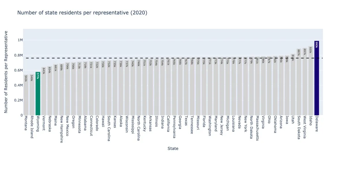 The winners and losers of the 2020 Census and House of Representatives apportionments. The fair assignment value (horizontal line) is the total US population divided by the total number of representatives (435). If the number of residents per representative in each state is less than fair, the state is overrepresented; if it is greater, is is underrepresented. The winners in 2020 were Montana, Rhode Island, and Wyoming. The losers were West Virginia, Idaho, and Delaware.
The winners and losers of the 2020 Census and House of Representatives apportionments. The fair assignment value (horizontal line) is the total US population divided by the total number of representatives (435). If the number of residents per representative in each state is less than fair, the state is overrepresented; if it is greater, is is underrepresented. The winners in 2020 were Montana, Rhode Island, and Wyoming. The losers were West Virginia, Idaho, and Delaware.
Delaware is highlighted in the figure. Let’s go back in time and see where Delaware falls over the past 70 years.
 2010.
2010.
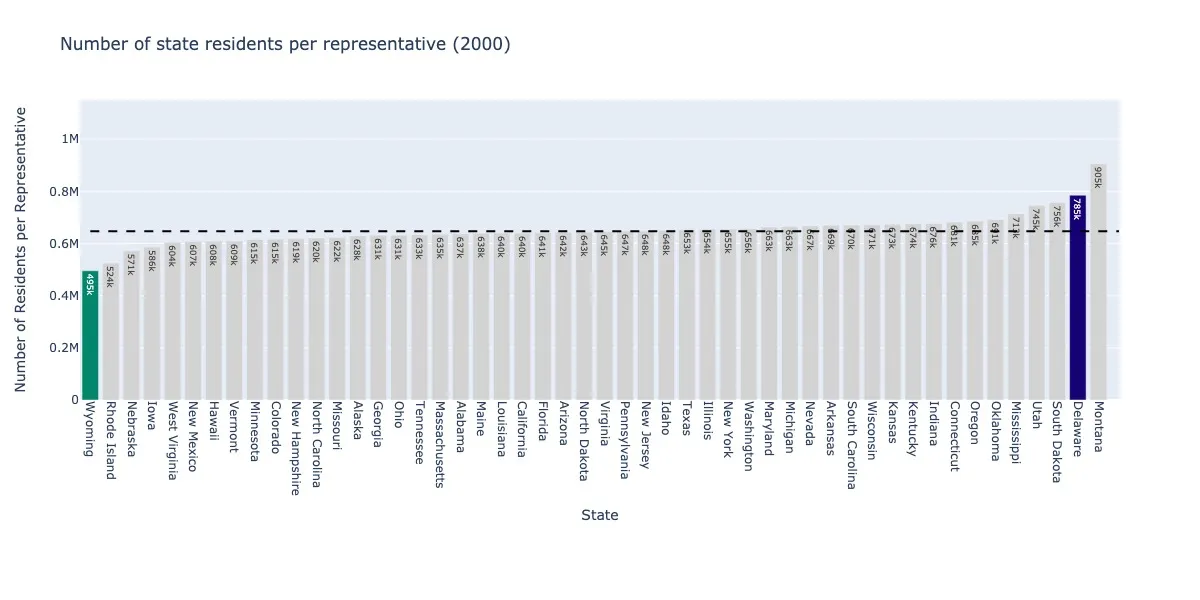 2000.
2000.
 1990.
1990.
 1980.
1980.
 1970.
1970.
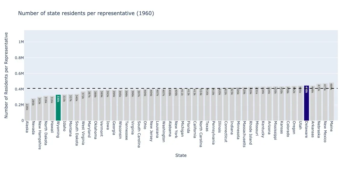 1960.
1960.
What rotten luck. Delaware has been underrepresented for the 70 years running (1960–2030, the date of the next Census). If this were a casino, other states would have an intervention for Delaware’s gambling addiction.
On the other hand, Wyoming has been a winning state, having been overrepresented every decade for the same time range. Other states like North Dakota or Montana have jumped from one end of the spectrum to the other. For these, the good and bad luck has somewhat averaged out over the decades. Only Delaware remains, still waiting for a winning hand. What’s holding it back?
The ranking trap
What’s behind it? Is it all just random chance? It certainly is not politics; while Wyoming is overrepresented and is dominantly a Republican state, Rhode Island and Vermont also appear on the same side of the plot, and both have leaned towards the Democratic party over the past half-century.
An important insight is that the algorithm depends not only on a state’s population, but on the state’s population ranking — that is, lining up all 50 states from highest to lowest population, at what position does the state appear?
 States ranked by population from highest to lowest based on the 2020 census. Colors indicate whether each state is over or underrepresented, based on comparing the ratio (state population / state representatives) to the fair ratio (US population / 435).
In the figure above, we rank the states by population from highest to lowest based on the 2020 census. Colors indicate whether each state is over or underrepresented, based on its representation fraction. This fraction compares the ratio (state population / state representatives) to the fair ratio (US population / 435):
pop_per_rep = state_pop / state_reps
pop_per_rep_fair = us_pop / 435
rep_frac = pop_per_rep / pop_per_rep_fair
A ratio of greater than 1 indicates that the state is underrepresented (the number of people assigned to each representative in the state is greater than it would be if the U.S. allowed non-integer assignments), and conversely a ratio of less than 1 indicates that the state is overrepresented. This doesn’t look entirely random — indeed, clusters of overrepresented and underrepresented states appear.
Here is the same data, showing the actual representation fraction mentioned above:
 Representation fraction for states ranked by population in the 2020 census. The representation fraction is defined as the ratio of (state population / state representatives) to the fair ratio (US population / 435). Clusters of overrepresented and underrepresented states appear — for example, Delaware, South Dakota and North Dakota are neighbors in population rank, and are all underrepresented together.
As states have a higher population, it’s easier for the representation fraction to be close to one. This arises just because dividing large populations by integer values gives smaller errors than dividing small populations by integer values.
At small populations, however, we see clusters of over and underrepresented states emerging. Particularly for states ranked in the mid-40s, we see a peak in underrepresented states (above 1, e.g. Delaware, South Dakota, North Dakota), while for states around ranking 40 or close to ranking 50 are overrepresented (below 1, e.g. Rhode Island, Montana, Alaska, Vermont, Wyoming). This pattern continues historically — for example, here is the same data for 2010:
 Representation fraction for states ranked by population in the 2010 census. The representation fraction is defined as the ratio of (state population / state representatives) to the fair ratio (US population / 435).
And here is the same data for all censuses from 1960–2020:
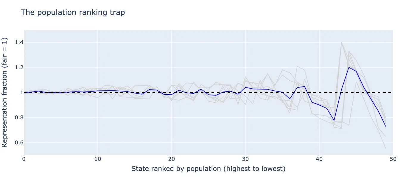 Representation fraction for states ranked by population (highest to lowest) from all census reports 1960–2020 (gray) and their average (blue). The representation fraction is defined as the ratio of (state population / state representatives) to the fair ratio (US population / 435).
A trap emerges for states with population rankings in the mid-40s. States in this population ranking trap are underrepresented in the US congress, not because of their own population but rather because of their population rank.
Delaware has had the incredible misfortune to be caught in this population ranking trap for the past 70 years. Here is one last visualization to drive this point home:
 The population ranking trap. The heatmap shows the states ranked by population for census reports from 1960–2020, with colors indicating whether the state was overrepresented or underrepresented for each decade. For population ranks in the mid-40s, a population ranking trap emerges (horizontal band of blue). Delaware (black) has had the misfortune of staying in this population ranking trap for the 70 years running.
Closing thoughts
The U.S. population distribution profoundly influences its politics. It’s fascinating to consider how small changes in the populations could alter significant legislation. While many analyses focus on redistricting representatives within a state, even the assignment of a fixed number of representatives to a state has profound effects.
States like Delaware are consistent losers in this analysis. Is it fair? A modern system could support fractional representation, where each state is a assigned a non-integer number of representatives based directly on it’s population.
Another inaccuracy that we didn’t discuss is the lag in the population data, which is re-computed every 10 years from the U.S. census. Population shifts, however, can occur at much faster scales — particularly due to seismic events like the COVID-19 pandemic, or economic booms and busts. In a modern information-powered age, can we demand more from our system? Or is the legacy code the best for a reason?
Thanks for following along.
You can reproduce this work with the following GitHub repo: https://github.com/smrfeld/house-of-reps.
Contents
Oliver K. Ernst
November 11, 2023