5 things the design of your keyboard got wrong
Your keyboard isn’t designed for you, and that’s bizarre.

I firmly believe we should design products for humans. Unfortunately, many products seem to be designed entirely arbitrarily, and human beings are left to try to adapt to these weird constructions.
Keyboards are definitely one of those products.
If you had to design a keyboard now, where would you start? The idea in my mind is simple:
The best position for your hands is the one where they are naturally relaxed.
Try it for yourself:
- Stand up and your arms next to your body.
- Raise your arms so they are horizontal from the elbow.
- Relax your hands. This is the best position for your hands.
Now place your hands on your keyboard. What’s happened?! How did we get from a natural posture to such this contorted pose?
The more I think about it, the stranger it gets. In a past life we were glorified apes fed up with gripping branches on trees, and now we’re operating machinery that couldn’t be further away from the original intent our hands evolved for. Keyboards may as well have been created by an alien civilization and dropped on Earth for humans to operate in suffering.
Here are 5 things the inventor of the keyboard had not observed about human hands — and some hope at the end. Try the three steps above, and observe your hands:
-
Your shoulders are shoulder-width apart, not right next to each other.
This shouldn’t be a surprise — all the humans I know have a torso between their shoulders.

If your shoulders are shoulder-width apart, why do we spend all day in a posture to bring our hands together?
-
Your fingers bend below your palms.
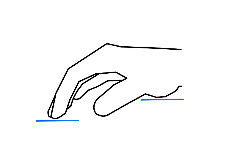
There are events in life where flat hands are required — clapping, high fives, military salutes.… But at the computer, let’s not get caught flat handed.
-
Your 5 fingertips on each hand aren’t in the same plane.
Not all fingers were made equally.
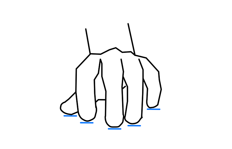
The curve is actually quite lovely — (finger) curves are beautiful! We should embrace them.
-
Your thumb isn’t underneath your palm.
And yet the control/option/command keys are! What gives?
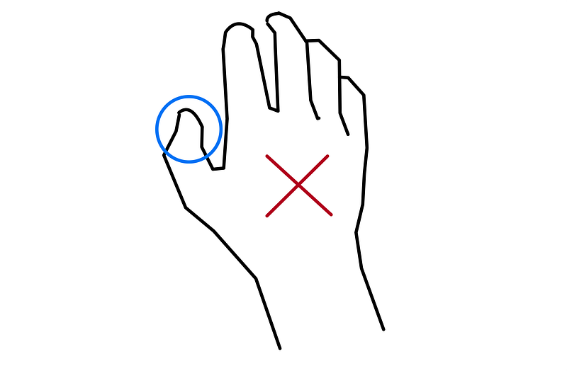
If you’re a programmer, or you just know your way around shortcuts, you’re reaching for those keys all the time. So why are they in such an inconvenient location?
-
Your fingers don’t like making small motions.
Especially not when they’re followed by hard impacts at the end of your keystrokes.
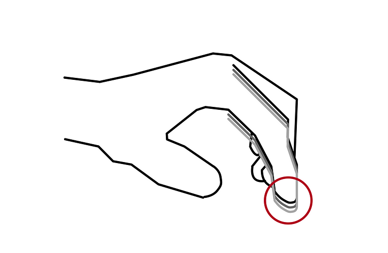
Granted, I’ve seen plenty of people hammering on they’re keyboards as if they could literally force words out of the ends of them, but I’m not sure that’s really a solution. Mechanical keyboards stand out here with their long keystrokes— but most still fail on the first four points. Plus, you have to use them correctly. Most switches have an audible or mechanical click indicating that you can stop pressing the key down — and you should, you hit the bottom.
What now
It seems clear that whoever designed keyboards originally has never observed human hands. On a “standard” keyboard, our hands are:
- Squeezed together.
- Awkwardly curved upward such that our fingertips and palms end in the same plane.
- Stretched at the pinky and compressed in the middle finger to bring them to the keys.
- Constantly shifting to reach for keys we often use, particularly with our thumbs.
- Moving us closer to repetitive stress injuries with every keystroke.
Ow, my back hurts just writing that!
Why don’t we design keyboards for human beings?
Before you complain, I get it. There are design constraints here — laptops need to be thin, and keyboards need to be cheap, stable, reliable…. But for home or office use, can’t we have something made for our ape-like hands? I mean, how expensive can some extra molded plastic really be?
a keyboard that solves these problems. The Kinesis pro Advantage2 is a keyboard that addresses every one of the five points above.
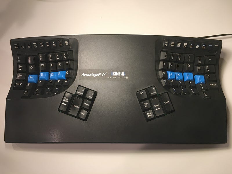
You can see from the image that the keys are placed apart so your hands aren’t squeezed together. They’re in wells, such that your palm rests above your fingertips. The keys are contoured to your fingers, and mechanical switches can stop you those hard impacts — but do stop when you feel the click, not when you hit the bottom of the keystroke! If there’s a parallel to “tailored clothing” for keyboards, this is it. The price is like tailored clothing, too. I can’t exactly excuse why a bit of extra plastic needs to run $300, but whenever I see it, that meme of Fry shouting “shut up and take my money!” pops into my head.
There you go. Now you, too, can be mad about poor keyboard designs. And if you reach a similar level of back pain as me, you can give the Kinesis a try. While you’re at it: might as well get a standing desk, learn Dvorak, and get a moderate amount of daily sunshine— your ape ancestors will thank you.
Contents
Oliver K. Ernst
July 7, 2020
